My Memories has made a Facebook group for this project, and many of the people in it are completely intimidated by digi-scrapping, just starting out and not sure where to go! I wouldn't claim to be an expert, but I do remember being in that position, and I thought I'd take the opportunity to share where I started out!
When you want to sew, you start with patterns, when you want to draw, start out tracing...when you want to scrapbook start with sketches or templates! It can take the pressure off of you for designing and really give you a chance to learn what you're doing, while pretty much guaranteeing you a great page!
Source: thescrappiest.blogspot.com via Melinda on Pinterest
So, here is a fairly simple sketch for a page with one photo that I am going to be putting my spin on. Notice there is one photo, there are three flowers and four paper shapes, but only one has rounded corners. This is called the Rule of Odd. Not to say that great pages can't be made with even numbers, but it's definitely something to keep in mind if you feel like your pages are lacking, try taking away a flower, or changing one shape into another, or adding just one button. It could help!
Normally, I would start with the furthest thing back on the page, but in this case, I'm going to start with the large, gray rectangle. It's touching everything and looks like a good piece to use to judge the positions in the rest of the layout.
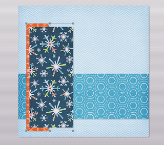
Choose a background, then using the shapes tap, add a rectangle. Enlarge it to the length of the layout and adjust the width before clicking to select your paper (or photo if you're using outside content). Your image may be distorted if you do it the other way.
In this photo, I have added the second large rectangle to the layout, shadowed and filled it with paper. Now I am going to group them together and send them to the back of the layout, behind the largest rectangle to match the sketch. To group them, first click on one, then hold your control key while clicking your second. Right click (or use the arrange tab at the top) to select arrange and group. Once they are grouped, right click again and select "send to back" to position them directly on top of your background paper.
Here, I decided I didn't like the look of that solid blue. To change the paper in your shapes, simply click on it and select the paper or photo tab again and select a new image. This can be done at any point in your layout, so don't be afraid to try something!
The next step shown in the above photo is adding a photo box. I prefer to adjust the box to the size that will fit my layout and then double click to add my image. That way, I know that it fits and I don't need to guess with cropping.
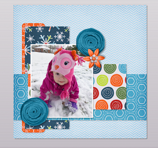
Now, the page is really starting to come together! I selected a photo of my daughter and added three flowers found in the embellishments tab. When using two identical embellishments as I did in this page, I like to either mirror or rotate one so that, at first glance, they don't appear to be the exact same thing.
At this point, I have decided to add my title. I find the grid (the graph paper looking icon along the top) to be really useful when lining up monograms or alphas. I chose to align my letters along the uncluttered area at the top of my page where it is easier to see. There is a function in My Memories called "snap to grid" that a lot of scrappers use to align their letters, but I prefer to manually place mine. Try it and see which way you like!
Here, I selected all of my letters and grouped them together. I scaled them down (while grouped, so that they all remain in the same proportions) and moved them to the bottom right of the layout in a slightly different position from the one in the sketch.
You may also notice that I changed the position of the dotted paper again. That one circle of really bright green was too distracting for me. If something stands out too much you have two choices, remove it, or add more of it! Double clicking on the shape and moving my image allowed me to have three bright green circles in my layout, and now it isn't taking away focus from my photo!
 |
| Kit used is Bella Gypsy's Be Merry |
To finish, I added two small text boxes. One for a short bit of journaling, and the other for the look of a handwritten date in the bottom corner.
If you have any questions, feel free to leave them in the comments and as long as you are not a "no reply" blogger, or as long as you leave your email, I will respond to you directly and try to help!


Thanks so much for sharing this. I am fairly new to digiscrapping and sometimes feel lost as to where to start.
ReplyDeleteIt's pretty effortless really. hehe except choosing the papers :) That's why kits are so good because all the papers go well together and it makes it just that bit easier. I love your layout. Some vibrant papers to match the vibrant photo.
ReplyDelete